Overview
Redesigned the initial onboarding flow for MyNetDiary, a health & wellness app with 32M+ users, after support feedback and funnel analysis revealed significant drop-offs during onboarding. We identified that users were struggling to understand the value of certain steps and were dropping off before reaching the core product experience.
The goal was to simplify the experience, make the value of the app clearer, and introduce more meaningful personalization.
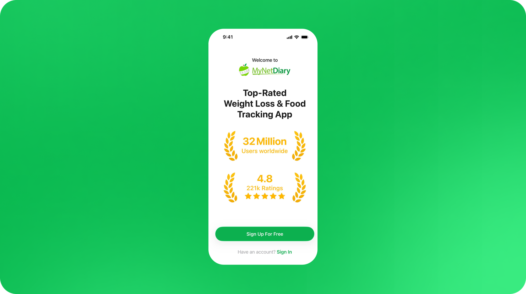
Why we redesigned?
We identified an opportunity to improve the onboarding funnel and understand why users were dropping off before reaching the core product experience. We used funnel analytics to identify where users were leaving and then looked at the experience leading up to that point to understand what could be improved.
Our initial hypothesis was that reducing friction and shortening the onboarding could improve completion. We tested this assumption through multiple A/B experiments, comparing the original flow with shorter and longer redesigned versions.
Problem
The existing onboarding experience became outdated from both UX and UI perspectives and no longer met modern health & wellness app standards.
Key issues:
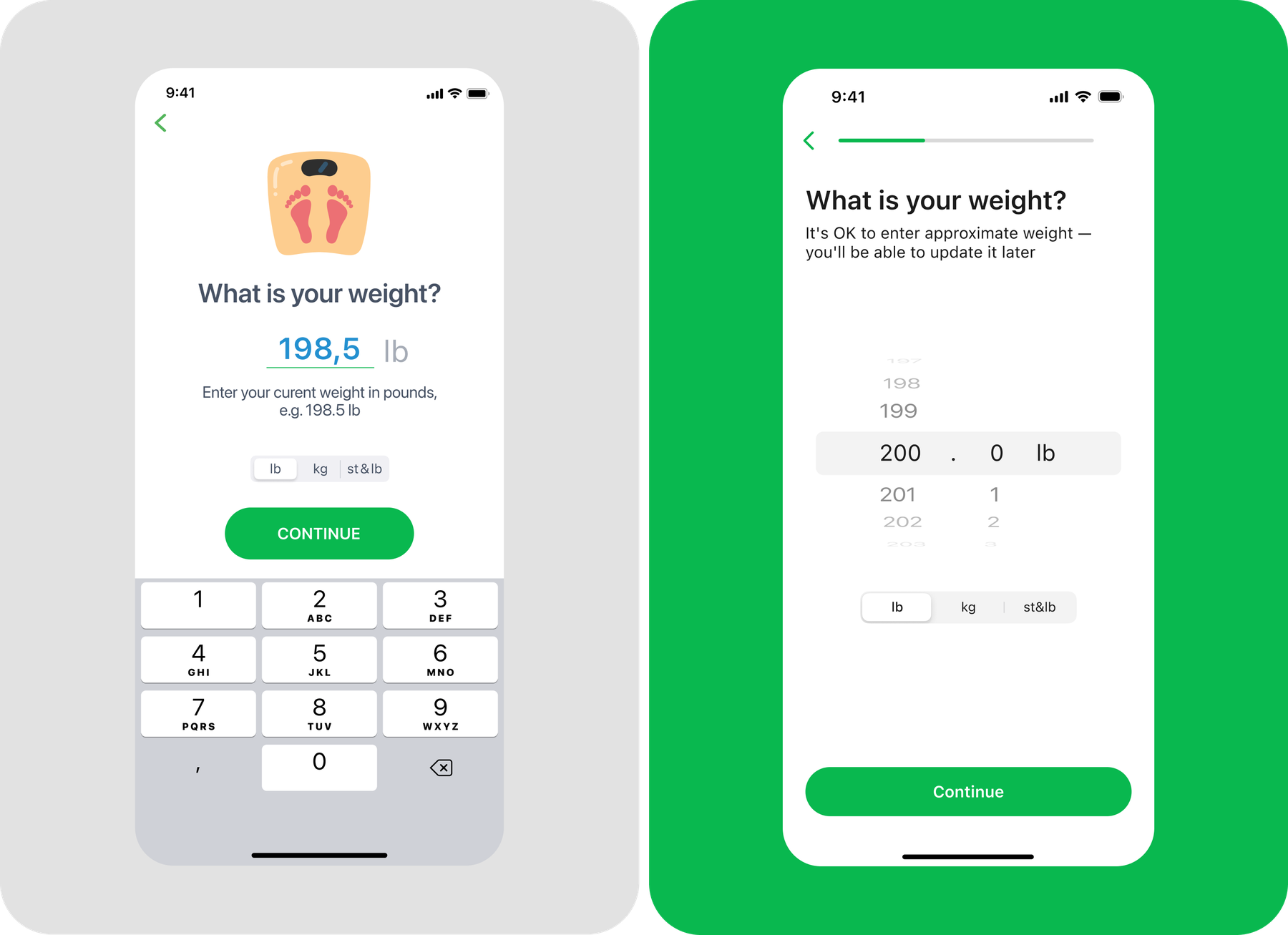
- Limited personalization — personalization was based only on gender, age, goals, without considering lifestyle, or user preferences.
- Lack of customization options — users could not choose nutrition plans, specify dietary restrictions, or add allergens.
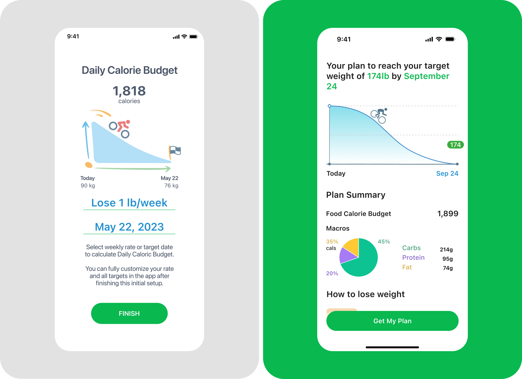
- Low emotional engagement — the onboarding did not visualize expected outcomes, such as weight loss progress and personalized goals.
- Outdated UX patterns — no clear progress indicators or engaging educational moments.
- Weak value communication — users did not clearly understand how the app would help them achieve their goals.
UX Improvements
Before
- Short generic flow
- Minimal personalization
- Limited explanation of product value
- Weak connection between user inputs and the final outcome
After
- Personalized user journey
- Adaptation to individual user goals and preferences
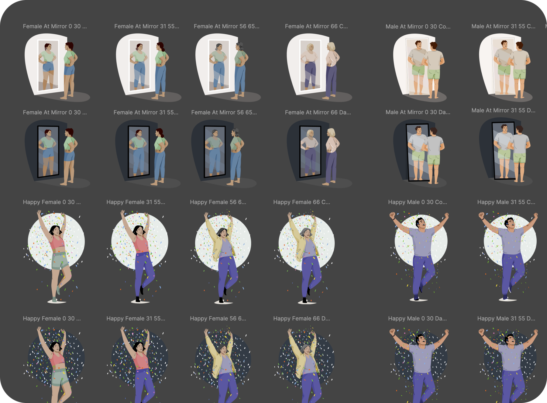
- Age and gender-based personalization with custom illustrations for different user segments
- Gradual value communication throughout the flow
- Visual progress confirmation
- Stronger emotional connection with the product
Approach & Decisions
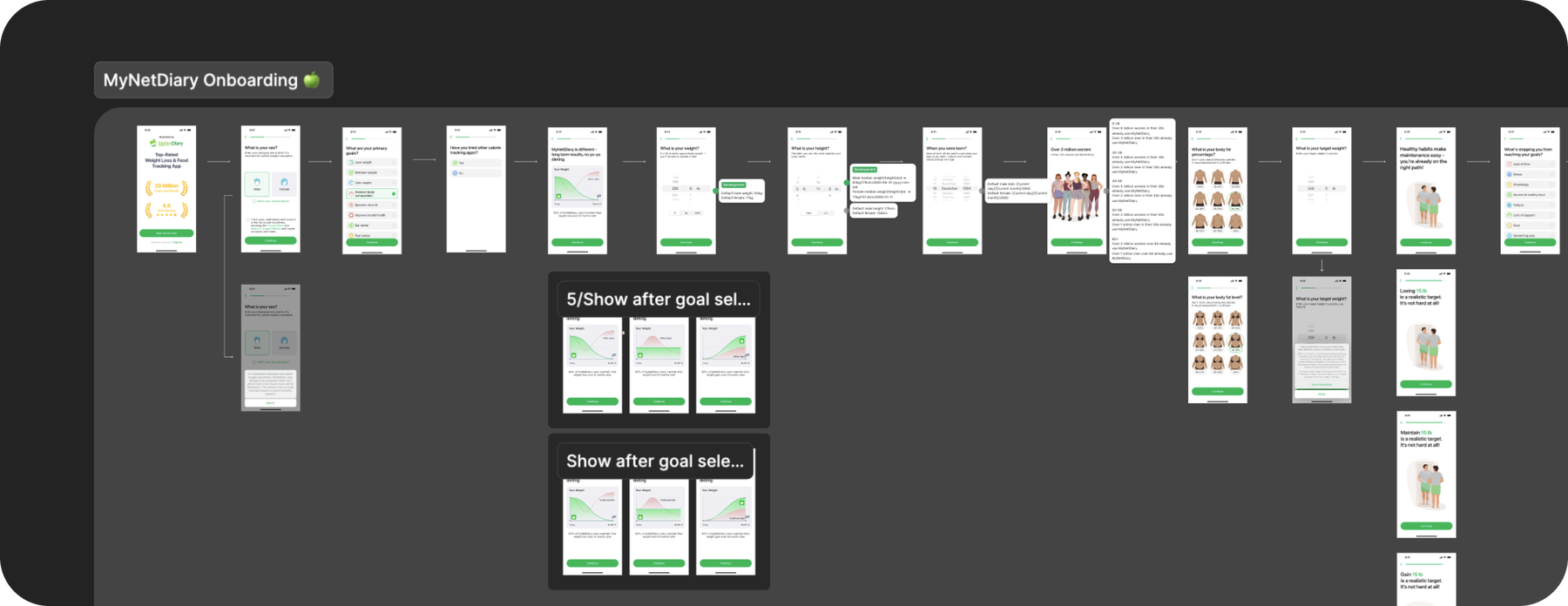
We approached onboarding as an iterative product optimization process. Rather than redesigning the flow all at once, we used funnel analytics and A/B testing to identify friction, validate hypotheses, and continuously improve the experience based on user behavior.
We ran 7 iterations, using A/B tests and funnel analytics after each release. We compared the original onboarding with both shorter and longer redesigned versions, allowing us to validate our assumptions and make decisions based on user behavior rather than intuition.
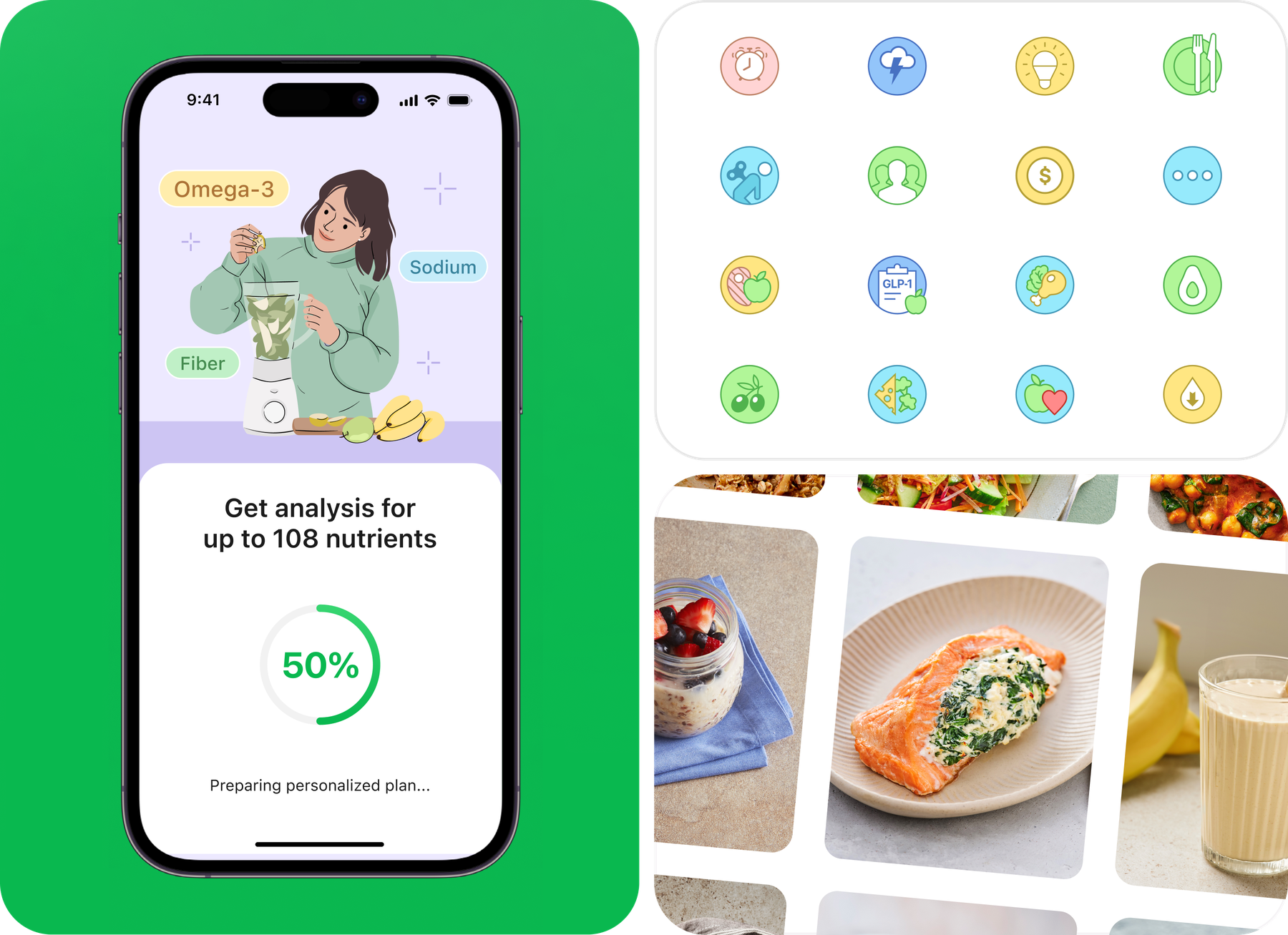
Diet Icons & Photo Collages. Custom icons and unique collages for each diet, using original photography created by our team.
Extending the Onboarding Experience
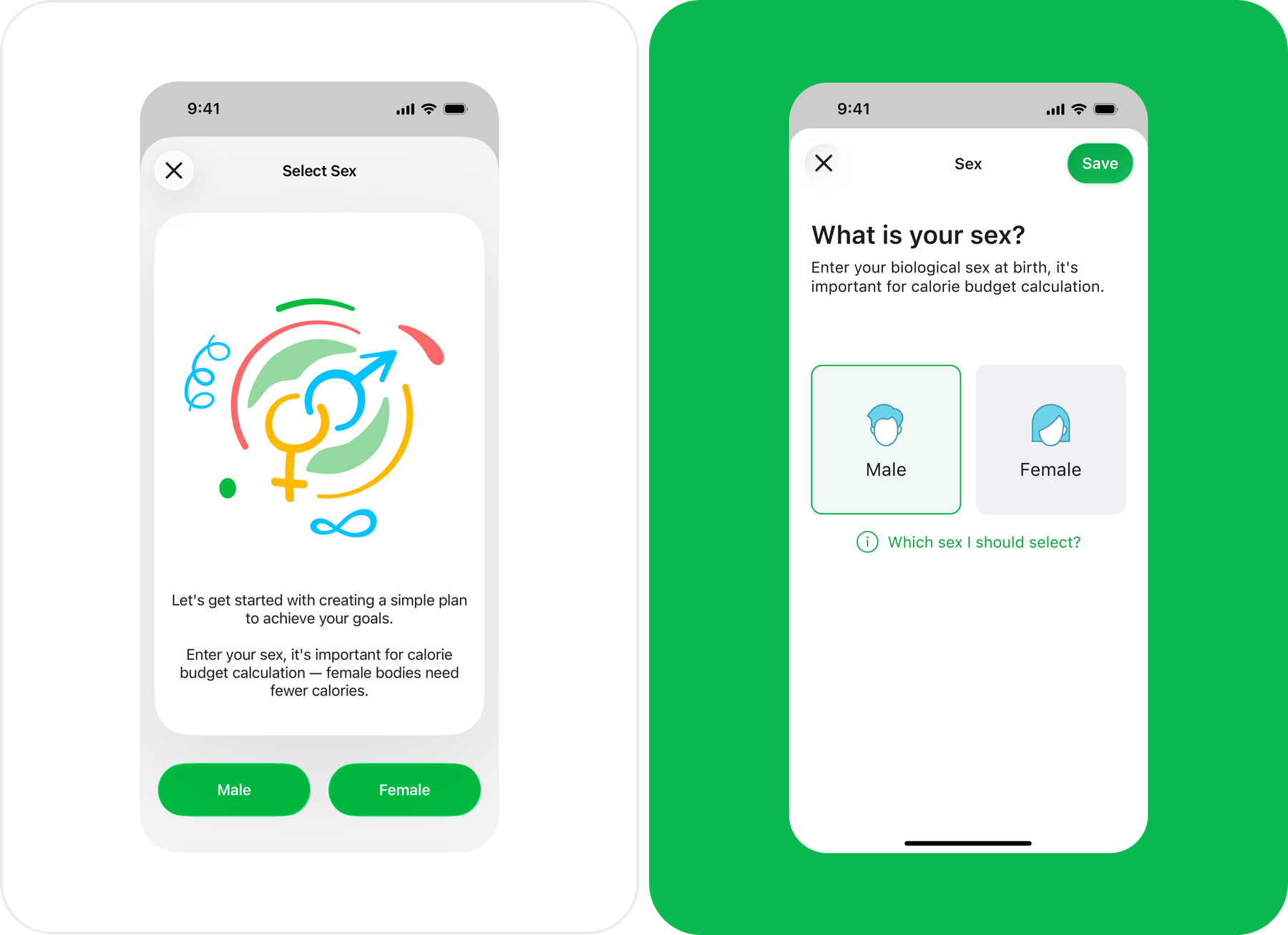
The visual language created for onboarding was also extended to the in-app settings screens. We unified the date of birth and gender selection screens with the onboarding experience to create a consistent experience across the product.
Result
- Conducted 7 iterations of the onboarding flow, with each iteration delivering measurable improvements in conversion.
- Onboarding conversion increased 2x+, with drop-off reduced by ~48%.
- Users were more engaged and more likely to complete the onboarding flow as they could see a clear connection between their inputs and the personalized experience they would receive.